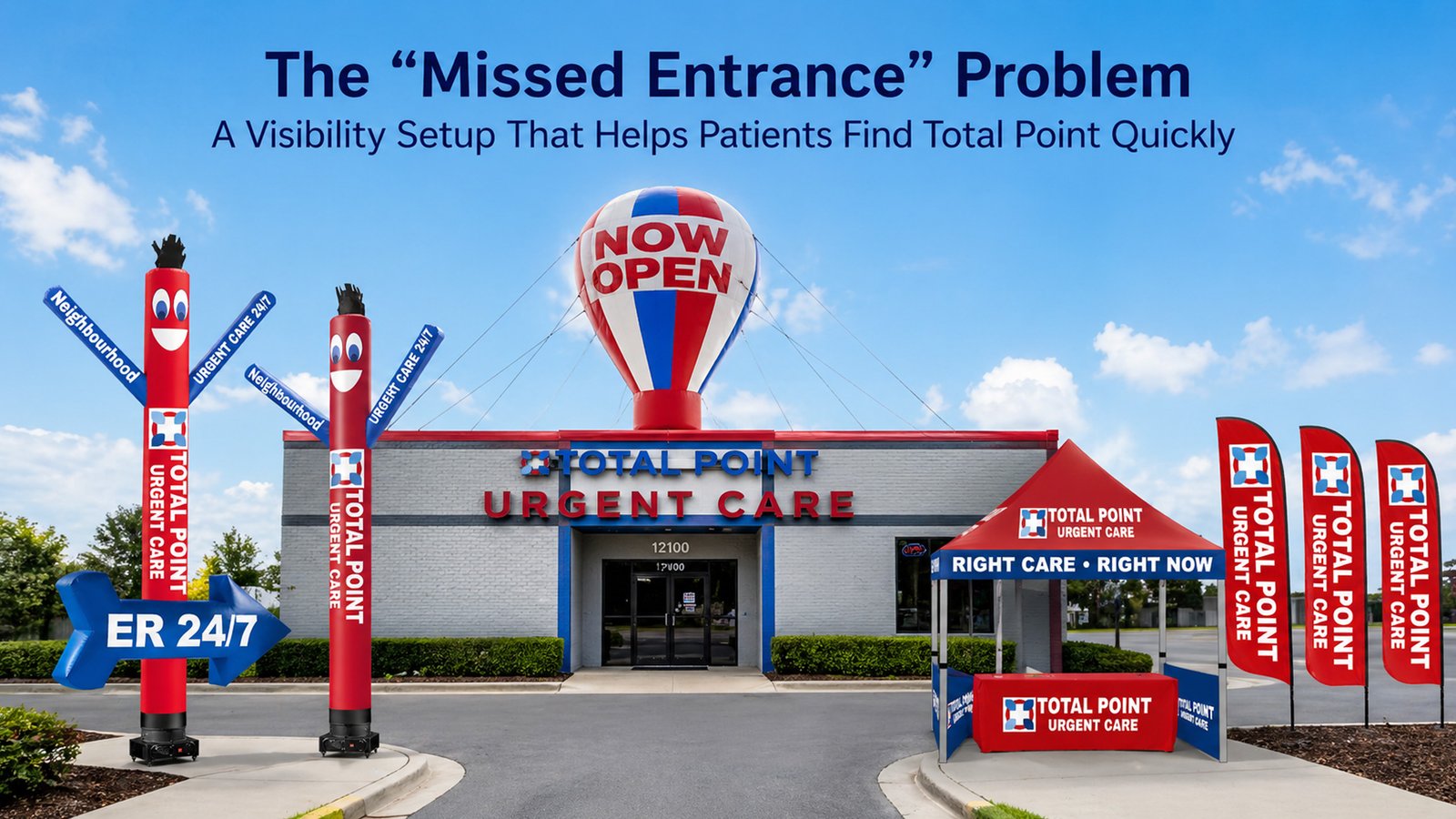
The Missed Entrance Problem: A Visibility Setup That Helps Patients Find Total Point Quickly
If you’ve ever watched someone slow down in front of your building… then keep driving, you already know how this story goes. They weren’t avoiding care, they just didn’t have enough time to process where the entrance is, which driveway to take, or whether they’re even in the right place.
For Total Point Urgent Care, this is more than a marketing issue. It’s a wayfinding issue. When patients are stressed, in pain, or traveling with family, they need your location to be easy to spot and easy to approach, without guesswork.
This guide lays out a practical visibility setup that helps patients find Total Point faster on busy roads, in strip centers, and in crowded medical plazas, using the exact branded assets you shared.
Why “missed entrances” happen more than clinics realize
In most cities, the problem isn’t that your building is hidden. It’s that the patient’s decision window is tiny.
A driver might have 2-4 seconds to:
- recognize your clinic
- decide “this is the place”
- locate the correct driveway
- safely turn in
If anything slows that down, parked cars, tall signs, landscaping, or a confusing entry, patients default to the easiest option: keep going and “look it up later.”
The patient moment in the car
Here’s what patients actually do (even if they don’t say it out loud):
They scan for something obvious first. Not a list of services. Not a small sign. Something that signals:
- “Yes, this is the clinic.”
- “Yes, this is the entrance.”
- “Yes, you can walk in.”
This is why a visibility setup needs layers: one layer to get seen early, another to guide the final 50 feet, and a third to make the entrance feel clear and welcoming.
The visibility funnel Total Point should use
A simple funnel works best:
Road visibility → driveway decision → parking confirmation → door clarity
Most clinics lose people in one of two places:
- They get noticed too late (after the driveway)
- They get noticed, but the entrance feels unclear (patients hesitate)
The solution is to make each step “obvious” without overwhelming people with text.
Roadside attention layer
This is where height and motion do the heavy lifting.
A tall air dancer creates a visual cue that drivers can’t miss, especially when your building blends into surrounding storefronts.
Use 20Ft Total Point Urgent Care Air Dancer when the main goal is to get noticed sooner from traffic.
Use 20Ft Total Point Urgent Care Air Dancer with Arrow Sign when your clinic has a common problem: drivers see you, but don’t know which entrance to take. The arrow turns attention into action by removing hesitation at the driveway moment.
The key is placement: this should be visible before the turn, not after.
Parking lot and walkway direction layer
Once patients turn in, the next question is: “Where do I go now?”
That’s where a clean directional system matters. In a plaza, people are often scanning multiple storefronts at once. A simple “guided path” prevents confusion.
Use 12Ft Total Point Urgent Care Feather Flags Pack of 3 as a wayfinding set, not decoration. Think of them as steps:
- one near the driveway/lot entrance to confirm they’re in the right place
- one closer to the walkway to keep them moving the correct direction
- one near the front to confirm “this door”
This reduces U-turns, second-guessing, and awkward parking-lot circling.
Entrance “stop zone” that reduces confusion
Once people walk up, you want the entrance to feel calm and organized.
A small, clean station near the door helps patients who are unsure what to do, especially during launch weeks, busy hours, or community outreach days.
Use 6Ft Total Point Urgent Care Table Cover to create a professional check-in/info point. The goal isn’t to sell anything. It’s to answer quick questions and reduce friction:
- “Is this urgent care or ER?”
- “Can I walk in?”
- “Where do I check in?”
Even a simple “Welcome” setup makes the clinic feel more approachable.
Pop-up presence for peak days and community outreach
There are days when your front-of-building presence matters more than usual: grand openings, new-location awareness pushes, school events, employer partnerships, and community health fairs.
That’s where tents do their job: they create an obvious “we’re here” zone.
Use 10x10fT Total Point Urgent Care Canopy Tent when you need a full outreach footprint, more visibility, more shade, and room for staff to engage comfortably.
Use 5x5fT Total Point Urgent Care Canopy Tent when space is tight or you want a quick setup for smaller activations (parking lot corners, sidewalk outreach, compact event spaces).
The tent isn’t just branding, it’s a signal that patients can walk up and ask questions without feeling awkward.
Placement rules that prevent wasted setup
Most visibility tools fail because of one reason: they’re placed where it’s convenient, not where it’s visible.
Before placing anything, do a quick line-of-sight check from the road:
- Are trees or poles blocking the view?
- Is a tall plaza sign covering the first glance?
- Do drivers see it early enough to turn safely?
- Does the setup guide people to the right door, not just “somewhere near the building”?
If the best view is from the opposite side of the building than you expected, trust the road view.
A simple launch-week plan for a new or relocated location
A clean seven-day visibility plan beats random setup every time:
- Run the roadside attention layer during peak traffic windows (morning commute, lunch, after-work)
- Keep the feather-flag path consistent so repeat drivers learn the location
- Use the entrance stop zone on weekends and high-traffic days when questions spike
- Use the tent on one or two “big days” (community outreach, weekend push) so people remember your presence
Consistency builds recognition faster than constantly changing layouts.
Measuring results without complicated tracking
You don’t need fancy dashboards to see whether the setup is working.
Use three simple checks:
- Compare walk-ins on days when the full setup is running vs days it isn’t
- Ask one calm question at check-in: “Was it easy to find us today?”
- Listen for the sentence that matters most: “I saw you from the road.”
If patients start saying that, the visibility funnel is doing its job.
Common mistakes and quick fixes
Too much messaging: People won’t read paragraphs from a car. Keep the outdoor message clean and short.
Wrong placement: If drivers only notice you after the driveway, move the attention layer earlier along the approach.
Looks random: Match spacing and layout so the setup feels intentional, not scattered.
No guidance after the turn: If people turn in but still wander, strengthen the feather-flag path.
Closing: make Total Point the easiest clinic to find on the block
When someone needs care, the last thing they should be doing is guessing where to turn or which door to use.
This visibility setup solves the missed entrance problem by making Total Point easy to spot early, easy to navigate once on-site, and easy to approach at the door. The goal isn’t “more advertising.” The goal is fewer wrong turns, fewer missed driveways, and a smoother patient experience from the road to reception.